

Chapter Divider

Title Page
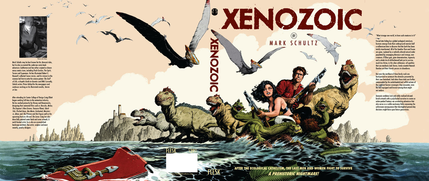
Final Cover Design
It's always a pleasure to work on projects with people who's work you admire. Xenozoic is certainly one of those projects. Mark Schultz's art is just plain beautiful to look at. When we started having dialog about how to go about designing this book, we decided the best approach, was to show a lot of white space on the new pages. Because Mark's artwork is so dense, it seemed to make sense to break things up with pages that would give your eye some resting places. So the approach was to simplify. With the chapter dividers, Mark did 20+ new illustrations, each representing an iconic interpretation of that story. The chapter title was discreet and slightly kerned out, giving it a look of sophistication. A small trilobite logo was placed at the bottom of the page to balance everything out.
The title page was set-up much the same way, with lots of white space. It's interesting how using white space becomes very much, a design element. I think too many times there is a desire to jam way too much information onto a page. What becomes the focal point? This way you can take in all the information, and possibly linger on it, longer.
There were a few changes to the final cover, one of them was obviously using Mark's painted version of his artwork. Mark also wanted to go back to the title type that wasn't angled, but still looked distressed. It represented something stronger and bolder. I think this falls into the same philosophy as the inside design, simpler is better. I think it's eye catching and very handsome as a final solution.
Check out John Fleskes blog (Flesk Publications) for a more in depth description of Mark's process of creating the cover illustration.


